
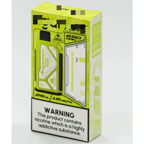
Brand color consistency is not a luxury—it's a business necessity. Every touchpoint where your brand appears, from packaging to digital displays, shapes customer perception and builds recognition. Color cards serve as the foundation for this consistency, ensuring that your brand's visual identity remains cohesive across all mediums and applications. Without proper color cards, your marketing materials risk appearing disjointed, unprofessional, and confusing to your audience.
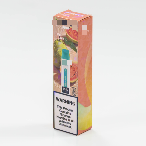
Understanding why color cards are essential requires recognizing how color psychology influences brand perception. Customers subconsciously associate specific colors with your brand within milliseconds of seeing your logo or packaging. Color cards establish a standardized reference system that translates brand vision into tangible, reproducible specifications. This standardization eliminates guesswork, prevents costly reprints, and ensures that every team member, supplier, and vendor interprets your brand colors accurately.
The Role of Color Cards in Brand Recognition
Building Instant Visual Identity
Color cards function as the visual DNA of your brand. When consumers see your signature colors consistently across social media, storefronts, and packaging, they develop instant brand recall. This recognition is invaluable in competitive markets where differentiation is critical. Color cards enable designers and marketers to replicate exact shades, ensuring that your blue on a website matches your blue on a printed brochure. Without color cards, variations creep in—a slightly different shade can make your brand feel scattered and unprofessional.
Creating Unified Market Presence
Across different regions, printing facilities, and production runs, color cards maintain uniformity. They serve as a universal language between your internal teams and external vendors. When a manufacturer in Asia, a printer in Europe, and a designer in North America all reference the same color cards, the output remains synchronized. This global coordination prevents the embarrassing scenario where your product line appears disjointed when placed side by side on retail shelves. Color cards translate subjective preferences into objective specifications—RGB values, Pantone numbers, CMYK percentages—that leave no room for interpretation.
Technical Specifications and Color Card Standards
Understanding Color Card Formats and Standards
Professional color cards come in multiple formats to serve different industries and applications. Pantone color cards provide standardized color references recognized globally by designers, printers, and manufacturers. RAL color cards offer industrial-grade standards used in coating, painting, and manufacturing sectors. RGB and CMYK specifications ensure digital and print accuracy, respectively. By establishing color cards in these standardized formats, your brand gains credibility and ensures reproducibility across all production environments. Color cards eliminate the confusion that arises when stakeholders describe colors verbally without technical reference points.
Implementation Across Production Systems
Effective color cards must account for the specific production methods used by your suppliers. A color specification for screen printing differs from specifications for digital printing or injection molding. Color cards document these variations, ensuring that each production method yields consistent results. Your packaging suppliers need color cards that reflect how colors appear on cardboard, film, or labels. Your digital marketing team needs color cards calibrated for screen display. By providing production-specific color cards, you enable each vendor to optimize color accuracy within their technical constraints. This systematic approach prevents the frustration of receiving samples that don't match brand expectations.
Business Impact and Cost Efficiency
Reducing Production Waste and Reprints
Color accuracy directly impacts production efficiency and profitability. When suppliers receive vague color instructions, they often produce batches that deviate from brand specifications, resulting in expensive reprints and material waste. Color cards provide clear, measurable standards that reduce trial-and-error cycles. Suppliers can validate their output against color cards before shipping, catching deviations early. This quality control mechanism saves significant money by preventing damaged inventory and customer returns. For large-scale production runs, the cost savings from reduced reprints often exceed the investment in professional color card development.
Strengthening Supplier Relationships and Quality
Suppliers appreciate clear, objective standards. Color cards demonstrate professionalism and reduce communication friction. When vendors receive well-documented color cards, they understand exactly what you expect, eliminating misalignment and dissatisfaction. This clarity strengthens relationships by setting realistic expectations from the start. Color cards also enable suppliers to develop process improvements and maintain consistent quality across multiple production runs. Long-term supplier relationships built on clear color specifications create competitive advantages through improved efficiency, lower costs, and faster turnaround times. Your suppliers become invested partners rather than vendors operating in ambiguity.
Strategic Implementation of Brand Color Cards
Developing a Comprehensive Color Card System
Creating effective color cards begins with defining your brand's core palette. Most brands require three to five primary colors that become instantly recognizable. Color cards document each primary color in multiple formats: Pantone spot colors, CMYK breakdown for printing, RGB values for digital use, and hex codes for web development. Secondary colors and accent shades should also be included with the same level of specification. Your color cards become part of your brand guidelines document, accessible to every team member and external partner. This centralized reference system prevents the fragmentation that occurs when different departments maintain separate color specifications.
Maintaining Color Card Accuracy Over Time
Color perception changes across printing methods, lighting conditions, and material surfaces. Professional color cards account for these variables. Periodic audits ensure that color cards remain accurate and that suppliers follow established standards. When you update your brand identity, color cards must be revised and redistributed to all stakeholders. This proactive maintenance prevents the slow drift toward inconsistency that occurs when suppliers work from outdated color specifications. Your design team should regularly compare actual production samples against color cards, noting any variations and communicating corrections to suppliers.
The investment in professional color cards pays dividends throughout your brand's lifecycle. Color cards transform subjective preferences into objective specifications, eliminate costly production errors, and strengthen your brand's visual presence. By treating color cards as a core component of your brand infrastructure, you signal professionalism to customers, partners, and stakeholders. In today's competitive market, brand consistency is a competitive advantage, and color cards are the tactical tool that enables this consistency at scale.
FAQ
How do color cards prevent production errors in manufacturing?
Color cards provide suppliers with objective reference standards that eliminate ambiguity. Manufacturers can compare their production against the color cards before shipping, catching deviations immediately. This quality control mechanism prevents batches from leaving the facility with incorrect colors, reducing the need for expensive reprints and material waste. Color cards translate vague descriptions like 'navy blue' into precise Pantone numbers and CMYK values that every supplier interprets identically.
What formats should professional color cards include?
Comprehensive color cards should include Pantone spot color references, CMYK percentages for print production, RGB values for digital displays, and hex codes for web applications. Additionally, color cards should specify how colors appear on different materials—cardboard, plastic, fabric, or film—since surface properties affect color perception. Including color specifications for different production methods ensures that your suppliers can achieve accuracy regardless of their manufacturing process or equipment.
How often should brand color cards be updated or reviewed?
Color cards should be reviewed annually or whenever brand guidelines are updated. Periodic audits comparing actual production samples against color card specifications help identify any drift or inconsistency. If you introduce new products with additional colors or modify your brand palette, color cards must be revised and redistributed immediately. Regular maintenance of color cards ensures that your brand remains visually consistent across all touchpoints and production cycles, protecting your investment in brand recognition.